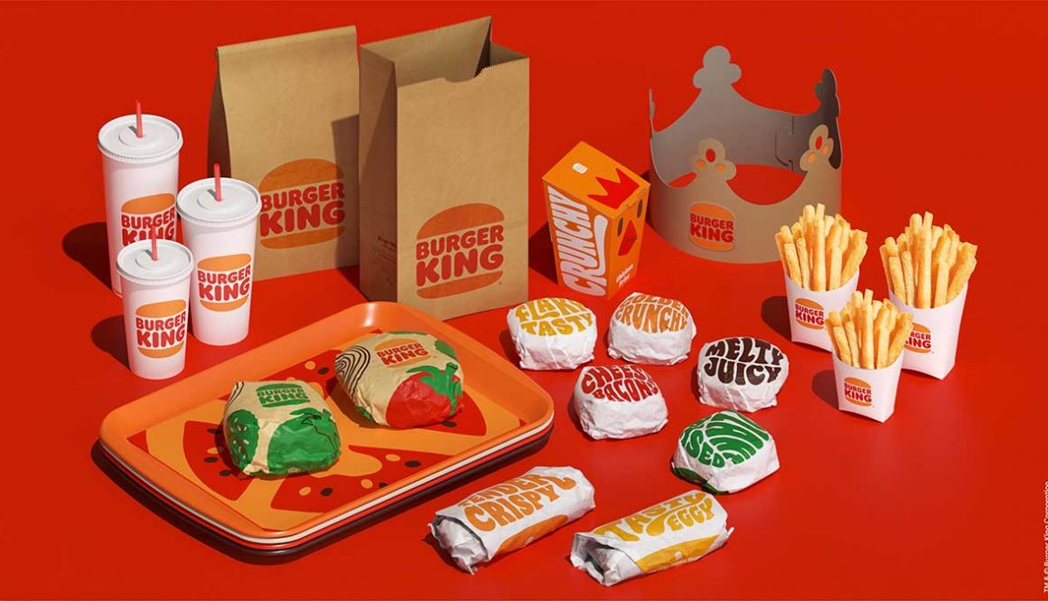
Burger King got it right
Burger King has unveiled a new logo design and overall rebrand, the first since 1999 when they added that blue swoosh. You know, the same swoosh everyone had back in the late 90s/early 00s. The new logo looks a lot like the logo before the swoosh, and I am totally into it. It takes me right back to my childhood, when I couldn’t wait to be big enough to eat a whole Whopper.
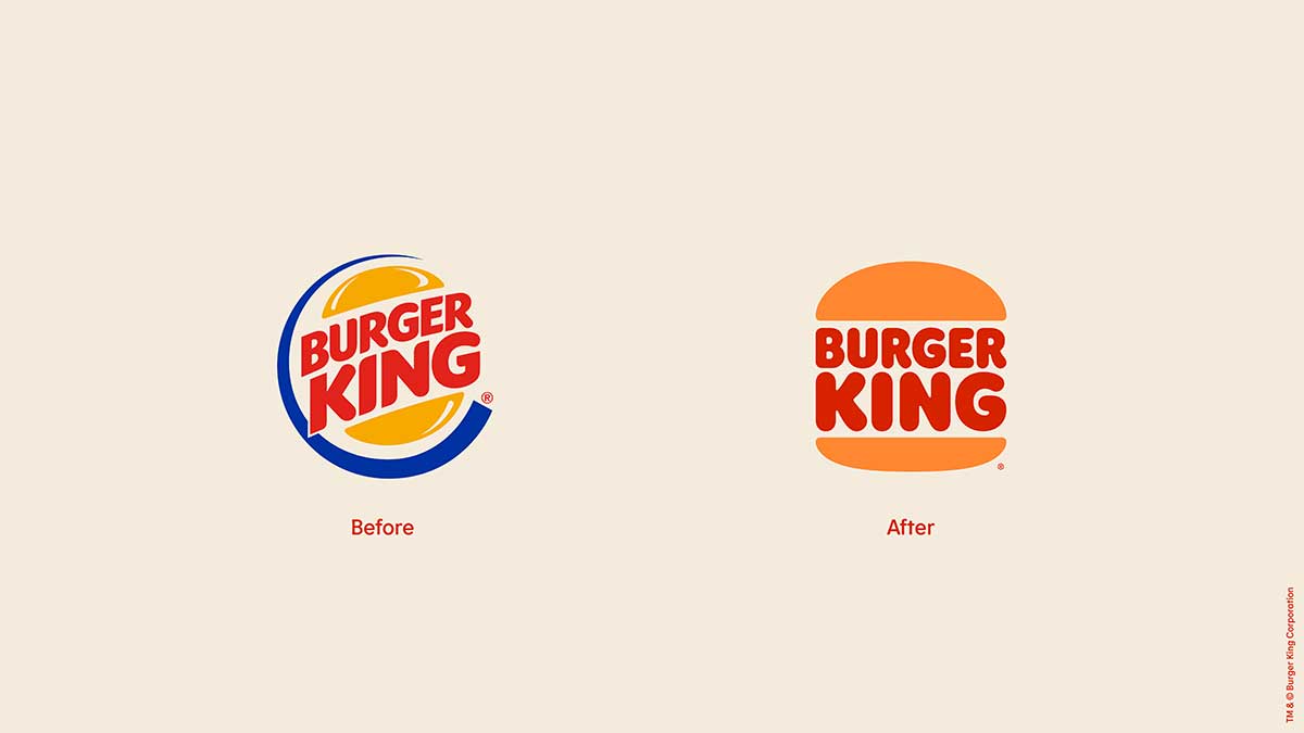
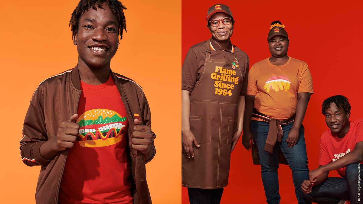
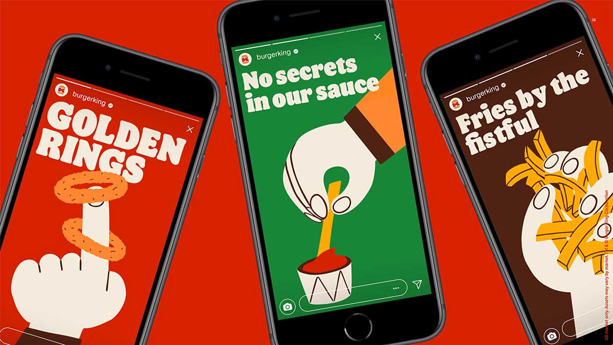
The new look is what’s called “flat design”, and it’s a design trend that has staying power because of its simplicity and versatility. What I really love about the rebrand is that BK went all in. The colors are vivid, but at the same time feel natural. They make you feel cozy. The font is funky and retro, but still pretty easy to read. And the illustrations are fun! I love that they incorporated them into the uniforms.
And I love that they had all this ready to go for their roll-out so you can really see how the rebrand is gonna work in real-life situations.
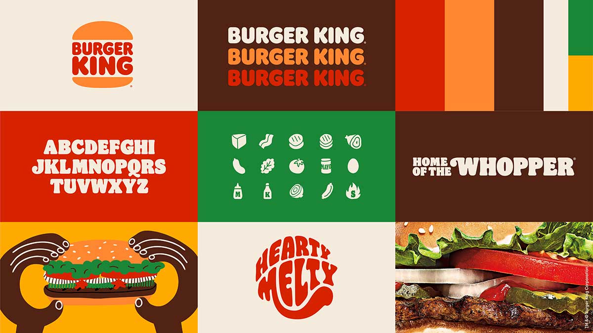
My favorite little detail is the app icon. The buns with the K burger and the overall B shape is just darn good design. It fits with the overall look and stands out in an overly complicated digital landscape. The whole look makes me hungry for a burger.
Now…about the King in those commercials. I can only hope he goes the way of the blue swoosh.

